The Generic Middle: Why AI Drafts Sag After the Intro
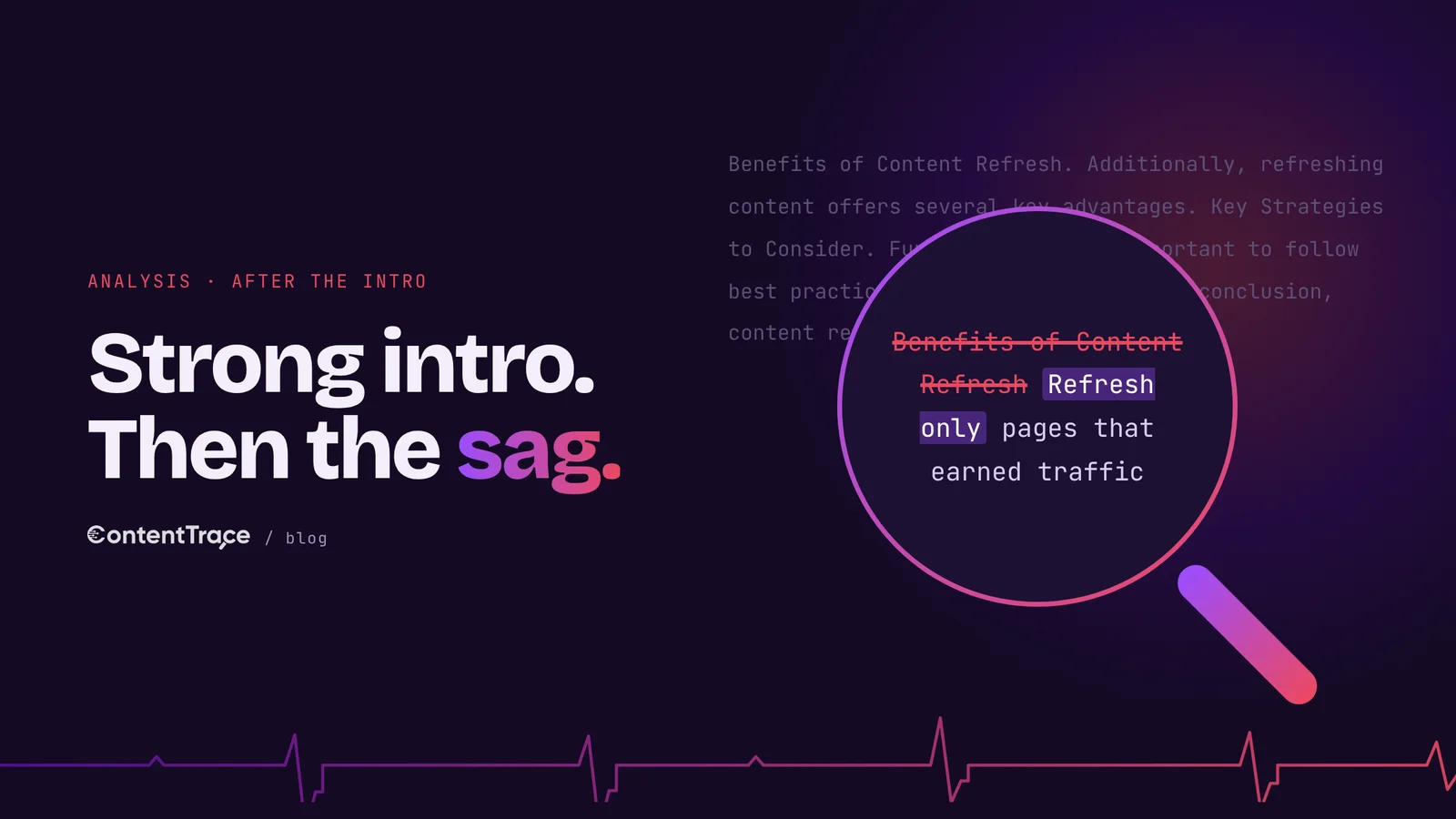
- →The intro is often the best part of a raw AI draft, because it inherits whatever specifics the prompt contained. The middle gets none.
- →AI middles sag in recognizable ways: parallel sections of equal length, headings that name a category, openers that restate the heading.
- →Readers scan the middle. Nielsen Norman Group found 74% of viewing time goes to the first two screenfuls, so the middle has to earn each scroll.
- →Generic headings give scanners nothing to grab. Front-loaded headings that state a claim give them the point even if they never read the paragraph.
- →Cutting length rarely fixes the sag. Moving the best evidence into the middle and breaking the template does.
In 2018, Nielsen Norman Group repeated an eyetracking analysis it had first run in 2010. Users spent about 57% of their page-viewing time above the fold, and 74% of it in the first two screenfuls. Attention still fell off sharply below the fold, eight years and a lot of redesigns later.
That number usually gets used to argue for putting the important stuff at the top. Fair enough. It also says something less comfortable about the middle of a page: the people who get there chose to. They read the intro and decided it was worth scrolling. They're the most interested readers you have.
And the middle is exactly where raw AI drafts go flat. The intro is fine, sometimes good. Then section two starts with "Understanding the basics," and the page settles into a steady, even, forgettable hum until the conclusion arrives to summarize it all again.
Nielsen Norman Group eyetracking, 2018. Everything below has to earn its scroll.
What the sag looks like on the page
Once you've seen the pattern, it's hard to miss. Take a hypothetical AI draft on content refresh. The intro names the problem well enough. Then come the H2s: "What Is Content Refresh?", "Benefits of Content Refresh", "Key Strategies for Content Refresh", "Common Challenges", "Best Practices", "Conclusion."
Every section is about the same length. Each opens by restating its own heading ("Content refresh offers several important benefits"). Most contain a bulleted list, and most of those lists have three items. Transitions do the connecting work that an argument should be doing: "Additionally," "Furthermore," "Another key consideration." Section five, "Best Practices," lists the practices of no one in particular.
None of these is a mistake on its own. Together they produce a page with no shape, and the boredom it creates is oddly specific: the feeling of hitting the third "Additionally" and realizing you could have stopped reading at the second heading and lost nothing.
Why AI middles come out this way
Here's the surprising part: the intro of a raw AI draft is often its strongest section. That runs against the usual advice, which treats intros as the weak spot. The reason is mechanical. Whatever specifics the prompt contained (the topic, the angle, maybe a statistic) get spent in the first few paragraphs, because that's where a model sets up the piece. By section two, the prompt has nothing left to give, and the model covers the remaining ground the way most of its sources cover it.
The outline makes it worse. Ask for an outline first and you'll usually get a coverage plan, a list of subtopics any article on the subject would include. Coverage plans produce parallel sections, and parallel sections invite parallel writing. Each one gets the same treatment because nothing in the plan says one matters more than another.
There's an insider version of this problem too. Many SEO content briefs build the outline from the H2s that top-ranking competitors use. Feed that outline to a model and you've asked it, very precisely, to write the same middle as everyone already on page one. Google's helpful-content guidance warns against content that is "mainly summarizing what others have to say without adding much value." A competitor-heading outline is a machine for producing exactly that.
Readers scan the middle, so the middle needs handholds
Nielsen Norman Group's work on the F-shaped reading pattern explains what happens next. People read across the top, read across again a bit lower, then scan down the left edge. They call it "the default pattern when there are no strong cues to attract the eyes towards meaningful information." A generic middle is a page with no strong cues.
"Make no mistake, the F-shaped scanning pattern is bad for users and businesses."Nielsen Norman Group · F-Shaped Pattern of Reading on the Web
The same article lists the fixes, and they're worth taking literally. Put the most important points in the first two paragraphs. Make headings visibly more important than body text. "Start headings and subheadings with the words carrying most information." Cut unnecessary content.
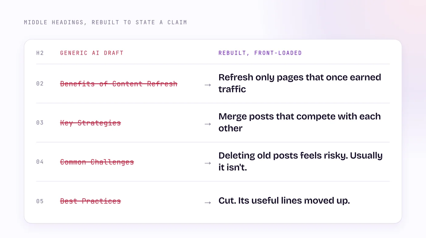
Run those rules against the hypothetical outline above and almost every heading fails. "Benefits of Content Refresh" starts with the least informative word on the page. A scanner who reads only the left edge of that heading learns that benefits exist. Compare "Refresh only pages that once earned traffic." The scanner who never reads the paragraph still leaves with the point.
How to rebuild a sagging middle
The obvious fix is to make the middle shorter. Cut two sections, trim the rest, publish. It doesn't work, because length was never the problem. A short middle made of the same templated sections still sags, just for fewer paragraphs. The problem is sameness, and the cure is giving each section a different job.
Start with one claim per section, written as the heading. If a section can't be summarized as a claim, it's probably a coverage section, and it can merge with a neighbor or go. "What Is Content Refresh?" rarely survives this test, because the reader who clicked already knows.
Next, move the best evidence into the middle. Writers instinctively spend their strongest example in the intro to hook the reader. In an AI-assisted draft, put the hook there, then save the real case or the number from your own data for section two or three. The intro makes a promise. The middle is where it gets paid.
Then break the template on purpose. Let one section run five paragraphs and the next run two. Swap a bulleted list for a short table, or for a single sharp paragraph. Open one section with the evidence and the next with the objection. Variety here does a job: it tells the reader which parts matter most.
Last, delete the transitions and see what breaks. If "Additionally" was the only thing connecting two sections, the order has no logic. Reorder them until each section answers the question the previous one raised. That's the difference between a list of topics and an argument, and readers feel it even when they can't name it.
Here's how the hypothetical content refresh draft looks after that treatment. The definition section is gone, folded into one sentence of the intro. Section two now reads "Refresh only pages that once earned traffic" and carries the strongest evidence in the piece, such as a traffic chart from the site's own analytics. Section three, "Merge the posts that compete with each other," is short and practical, with a two-column table of which page keeps the URL. Section four takes the objection head on: "Deleting old posts feels risky. Usually it isn't." It runs long, because that's where readers push back hardest.
The "Best Practices" section disappeared entirely. Its useful lines moved into the sections where they actually applied, and the rest turned out to be the generic advice that every competing article already contained. A reader wouldn't miss it. The conclusion got shorter too, since there was no longer a pile of parallel sections to summarize. The rebuilt draft also comes out shorter, a side effect worth noticing: once each section had a job, the filler had nowhere to sit.
Check the middle on its own
A whole-page read hides a sagging middle, because a good intro sets the mood and the reader's goodwill lasts a while. Read the middle cold instead. Start at the second H2 and read to the conclusion, as if you'd landed there from a search result. Mark every paragraph that could appear, unchanged, in a competitor's article on the same topic. Those paragraphs are the sag, and the count tells you how much rebuilding is left.
A diagnostic makes this faster. Paste the middle sections into Content Trace on their own and compare them with the full piece. It explains the Human Score with 32 signals in 8 sections, so a weak middle shows up as specific problems: predictable list structures, or generic language where a specific detail should be. Treat the result as a pointer to which section to rebuild first.
Rebuilding a middle takes longer than writing a better intro. It's also where the readers who stayed are deciding whether you were worth it.
Frequently asked questions
A weak middle often starts with a thin brief, which is the subject of Prompting for a Better First Draft. The Specificity Test helps find the evidence the middle needs. And Google Is Fine With AI-Assisted Content explains why readers, more than search engines, punish generic pages.
Colin H builds ContentTrace at Web Thrive. He has spent 20+ years in B2B SaaS marketing, running content, SEO and AEO programs, and now builds them around AI-assisted content production. Read the ContentTrace manifesto